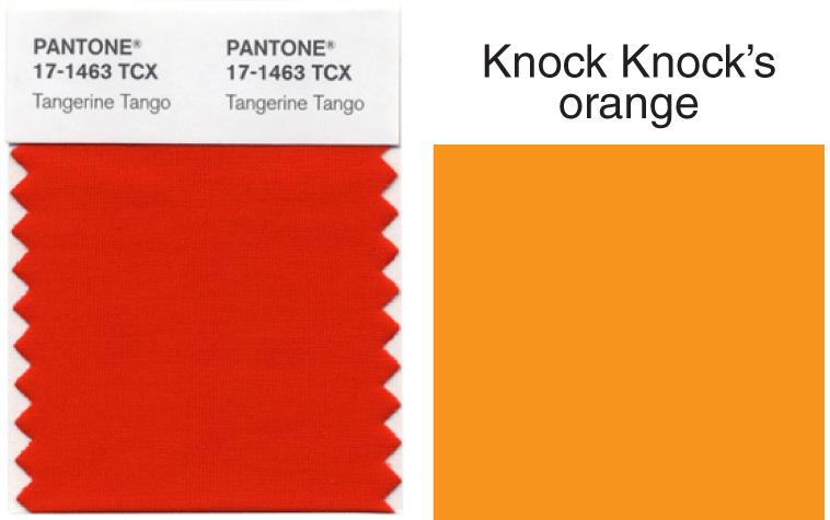
We know, we know. The news of Tangerine Tango being named 2012 Pantone Color of the Year is as ubiquitous among the online design community as PMS swatches are in our office. However, because it’s the onset of the New Year and our company color logo is orange, we couldn’t help but still treat this news as a good omen of things to come.
We also realize that the Knock Knock orange isn’t as reddish as the former and is actually much yellower (with a PMS color of 0 C; 50 M; 100 Y; 0 K, to be exact). Also, word to a fraction of the color-blind (who can empathize with us treating the two shades as equals).
Additionally, it’s almost as if our hue is Tangerine Tango’s sage, vintage-styled cousin, no?
And in case you didn’t know: ten years ago, our head honcho, Jen, chose this specific shade because her front door, which had “Knock Knock” written on it, was painted the same color. She was also “in love with orange at the time.”
So, let’s all say it at once: “Hooray for orange!”